Introduction
These guidelines provide a flexible design system that can accommodate any creative application of the Arm brand across a range of visual expressions.
The system presents creative possibilities and works across all media while maintaining brand consistency and recognition across every touchpoint. With a flexible approach to distinct visual elements, the Arm brand comes alive showcasing our innovative technology, our commitment to our partner ecosystem, and our vision to build the future on Arm.
Event Theme
The theme is rooted in the fact that Arm is defining the future of computing. We are driving change and disrupting the expected pathway… after all, we’re a company that is powering the next set of technology revolutions.
We will use the Arm ‘Spotlight’ graphic in a new and dramatic way combined with 3D textures. This idea will create dramatic compositions that reinforce the idea that Arm (and its partner ecosystem) is constantly moving forward, creating new perspectives and driving change. The future is built on Arm.
We also want to highlight and embrace the beautiful architecture of Cambridge (truly unique to APM) — Arm’s future facing technology co-exists with Cambridge so we will look to create 3D renders of Cambridge buildings and bring them to life into the digital world.
Brand Direction
Logo
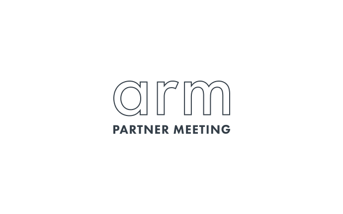
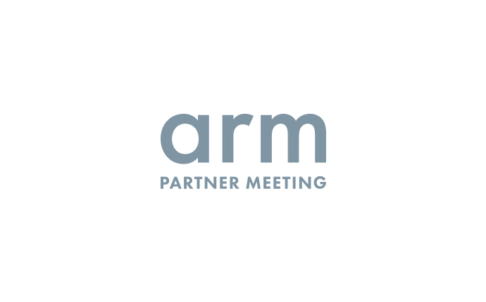
The Logos
The APM 2023 logo is detailed here, along with clear space rules.
It is essential to give the logos clear space, so that they are identifiable and legible.
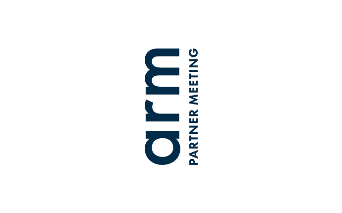
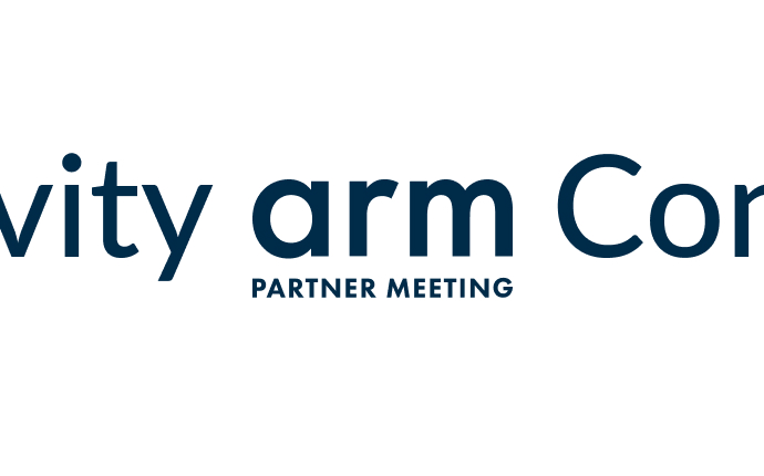
Horizontal Logo
The horizontal APM logo is detailed here, along with clear space rules.
The main logo should always be used where possible, however the other two may be used in appropriate applications.
It is essential to give the logos clear space, so that they are identifiable and legible.
Misuse
Use of the APM 2023 logo should remain consistent throughout all applications, although the placement of the logo should be left to the discretion of the designer, below are some rules of thumb to be followed without exception.

Do not set logo in any colour other than specified.

Do not add any special effect to the logo.
Do not outline the logo.
Do not rotate the logo at inconsistent angles.
Do not re-order or break apart the logo.
Do not stretch or distort the logo.
Do not attach any text or headline to the logo.

Do not crop the logo.
Do not set the logo in any opacity other than 100%.
Typography
Typography Overview
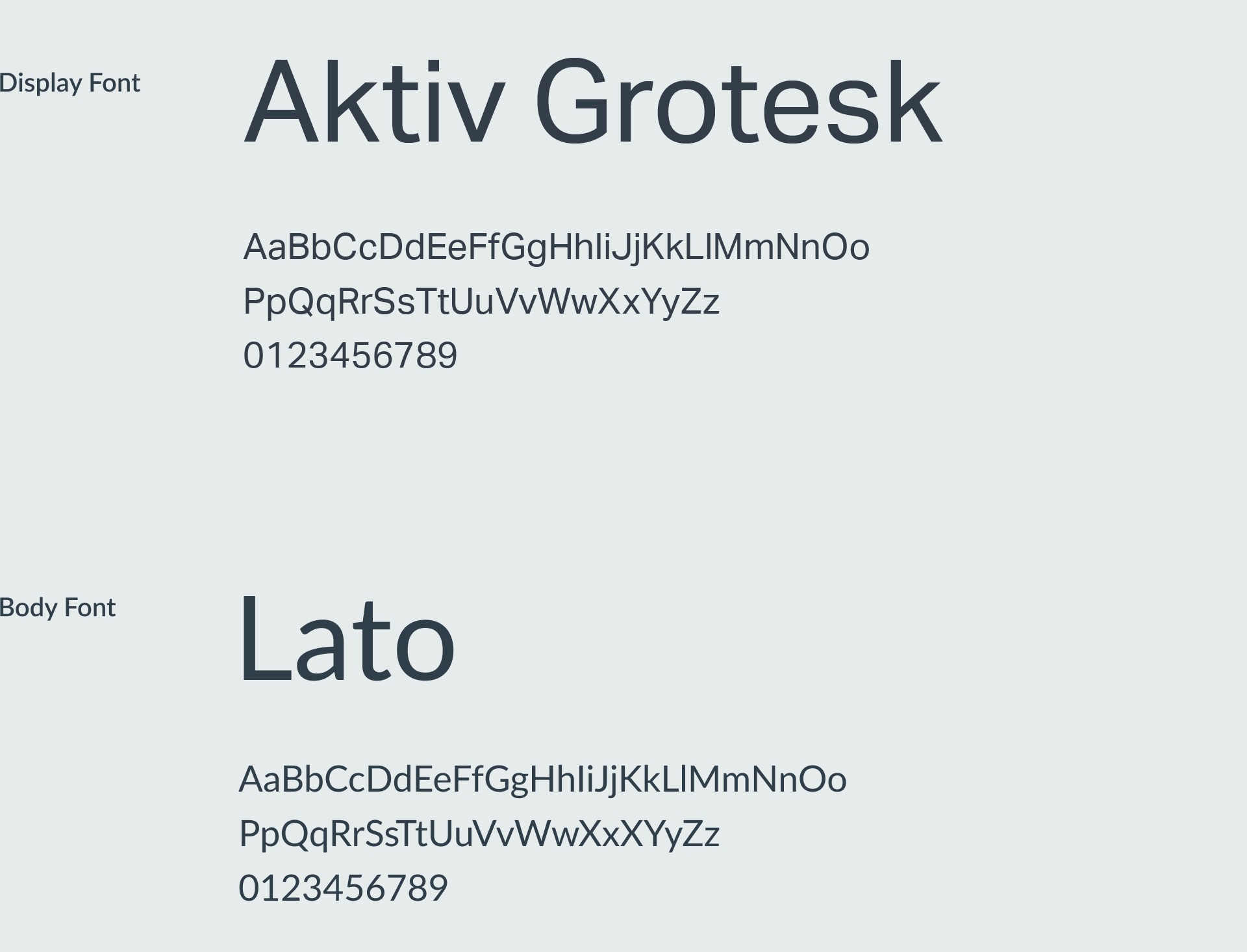
APM 2023 utilises two fonts, Aktiv Grotesk and Lato.
Aktiv Grotesk should be the main headline typeface, and can be used for large-scale applications.
Lato is the primary Arm brand typeface, and should be used across all other placements for APM 2023.
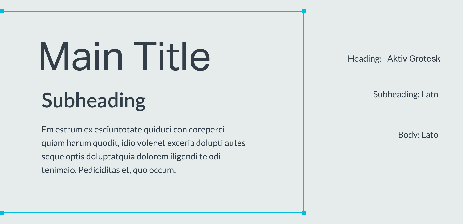
Hierarchy
To ensure consistency, this basic hierarchy of text should be followed.
Colour
Colour Palette Overview
Our colours help articulate the dimensions of our brand identity. Neutral and cool colours can reference technology, while the vibrant warm colours can evoke energy and inspiration.

Gradients
Our highlight colours can be combined to make unique APM gradients.

Adjacent Colours
Our palette of neutral, cool, and warm colours allows for a variety of combinations. Adjacent colours compliment each other, while the neutral colours provide options for further depth.

Overview
Our colours help to articulate the dimensions of our brand identity. Neutral and cool colours can reference technology, while the vibrant warm colours can evoke energy and inspiration.
APM Tech Blue
R: 50
G: 99
B: 238
HEX: #1E60F6
G: 99
B: 238
HEX: #1E60F6
Arm Light Blue
R: 0
G: 193
B: 222
HEX: #00C4E2
G: 193
B: 222
HEX: #00C4E2
Arm Orange
R: 255
G: 107
B: 0
HEX: #FF5E00
G: 107
B: 0
HEX: #FF5E00
Arm Yellow
R: 255
G: 199
B: 0
HEX: #FFC600
G: 199
B: 0
HEX: #FFC600
Arm Mid Blue
R: 0
G: 145
B: 189
HEX: #0093C2
G: 145
B: 189
HEX: #0093C2
Arm Light Gray
R: 229
G: 236
B: 235
HEX: #E3ECEB
G: 236
B: 235
HEX: #E3ECEB
APM Black
R: 0
G: 10
B: 15
HEX: #000A10
G: 10
B: 15
HEX: #000A10
Arm Dark Blue
R: 0
G: 43
B: 73
HEX: #002B4C
G: 43
B: 73
HEX: #002B4C
White
R: 255
G: 255
B: 255
HEX: #FFFFFF
G: 255
B: 255
HEX: #FFFFFF
Iconography
Overview
APM 2023 should use standard Arm iconography.
Construction
Drawing of Arm icons should follow the guidance provided in the Arm Brand Guidelines.
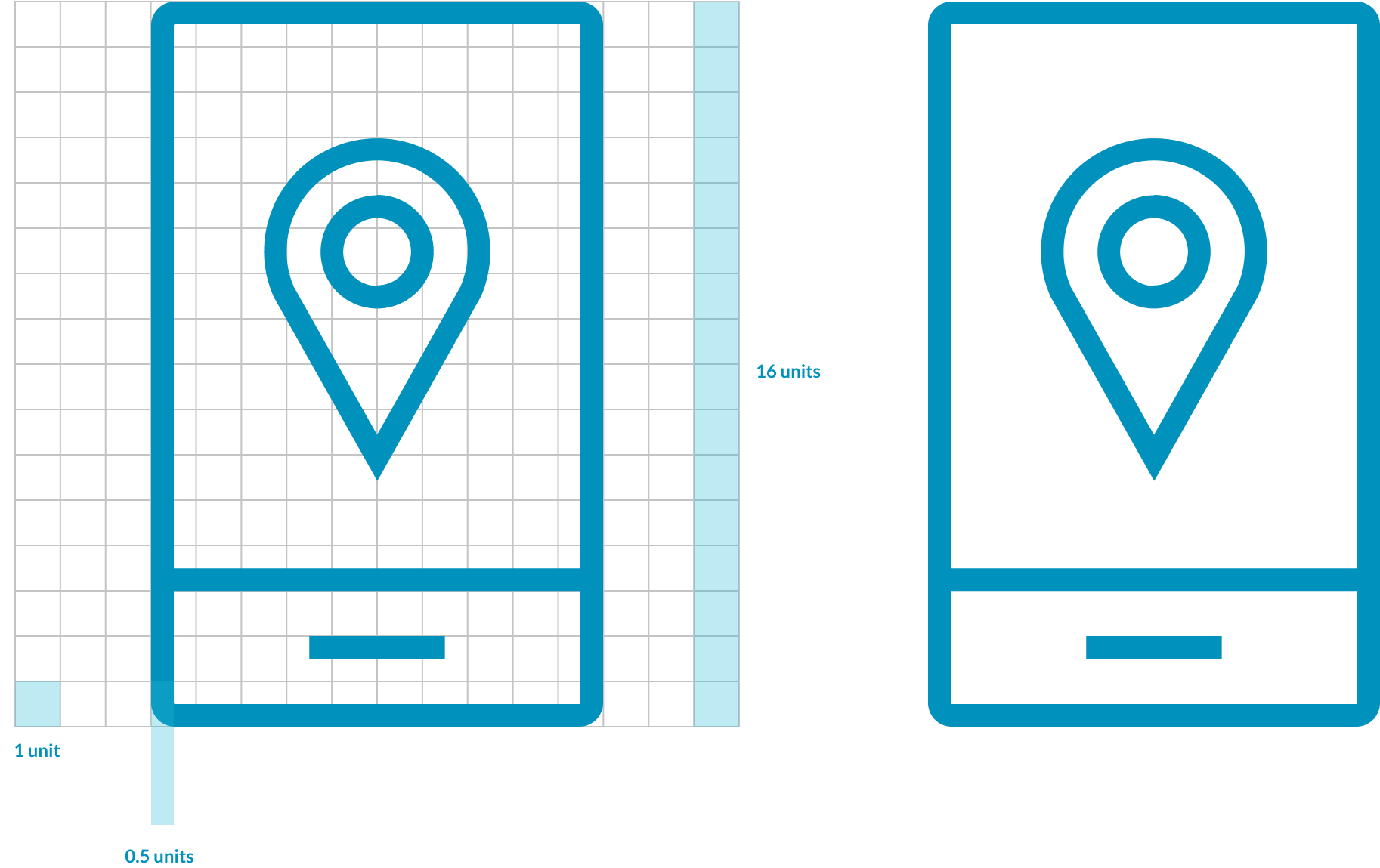
Image Treatments
Image Treatment
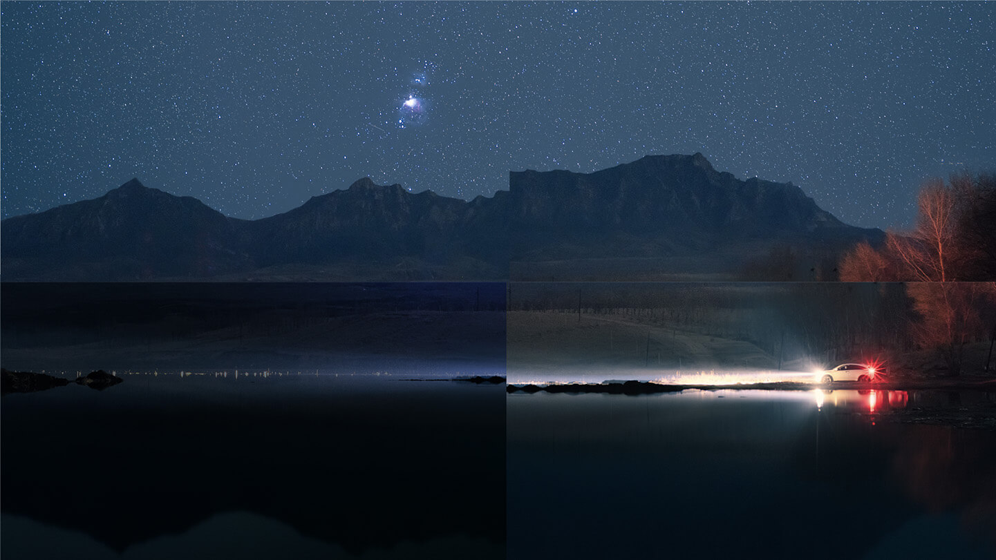
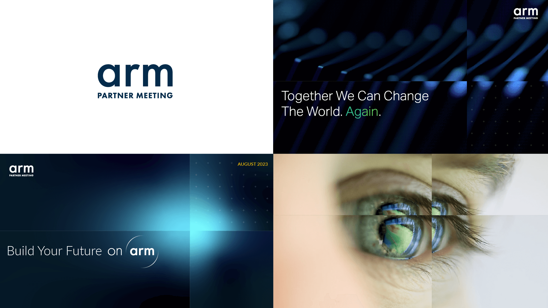
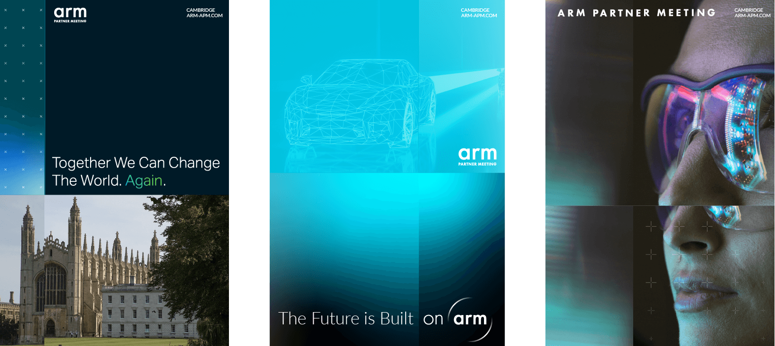
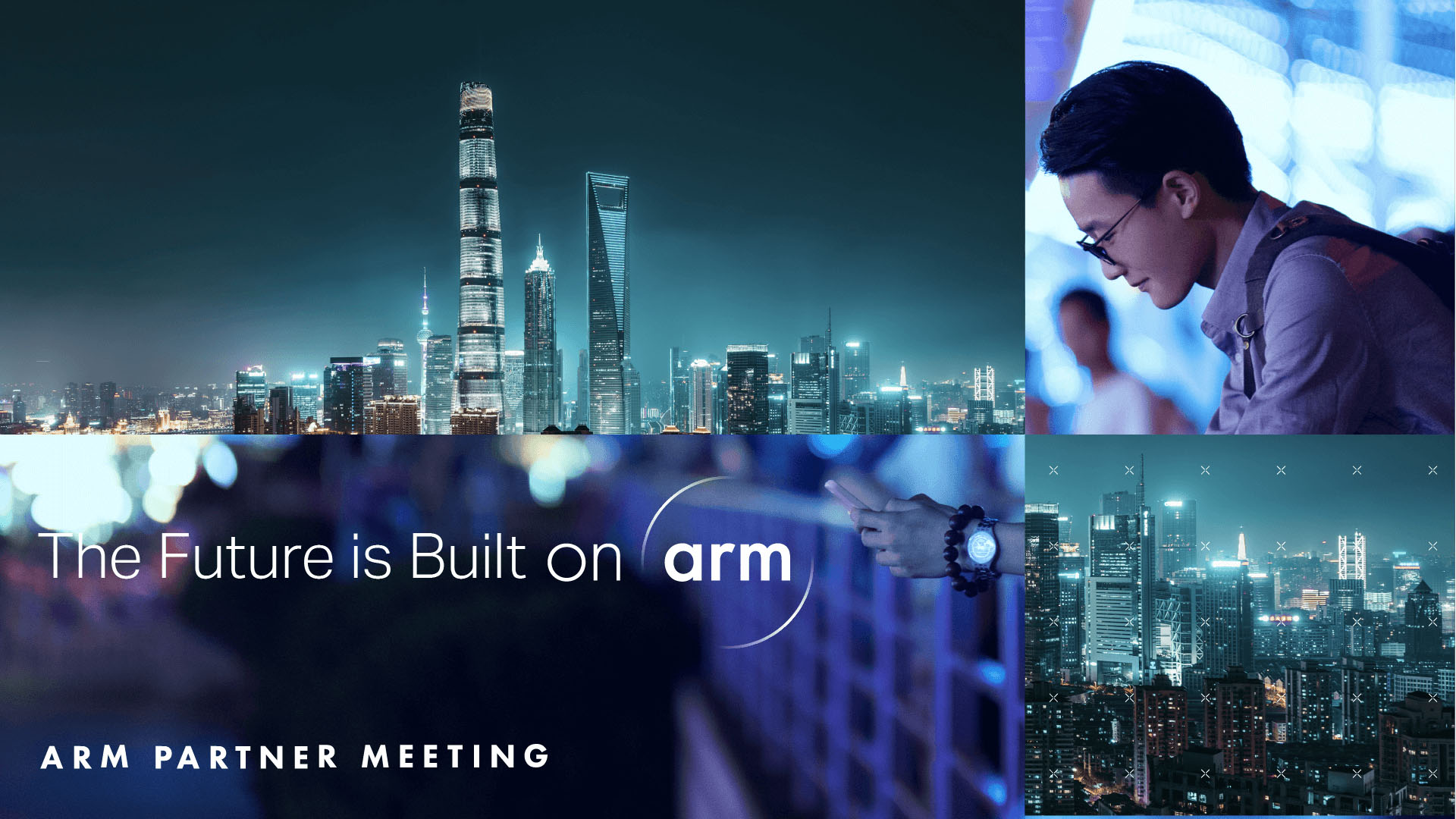
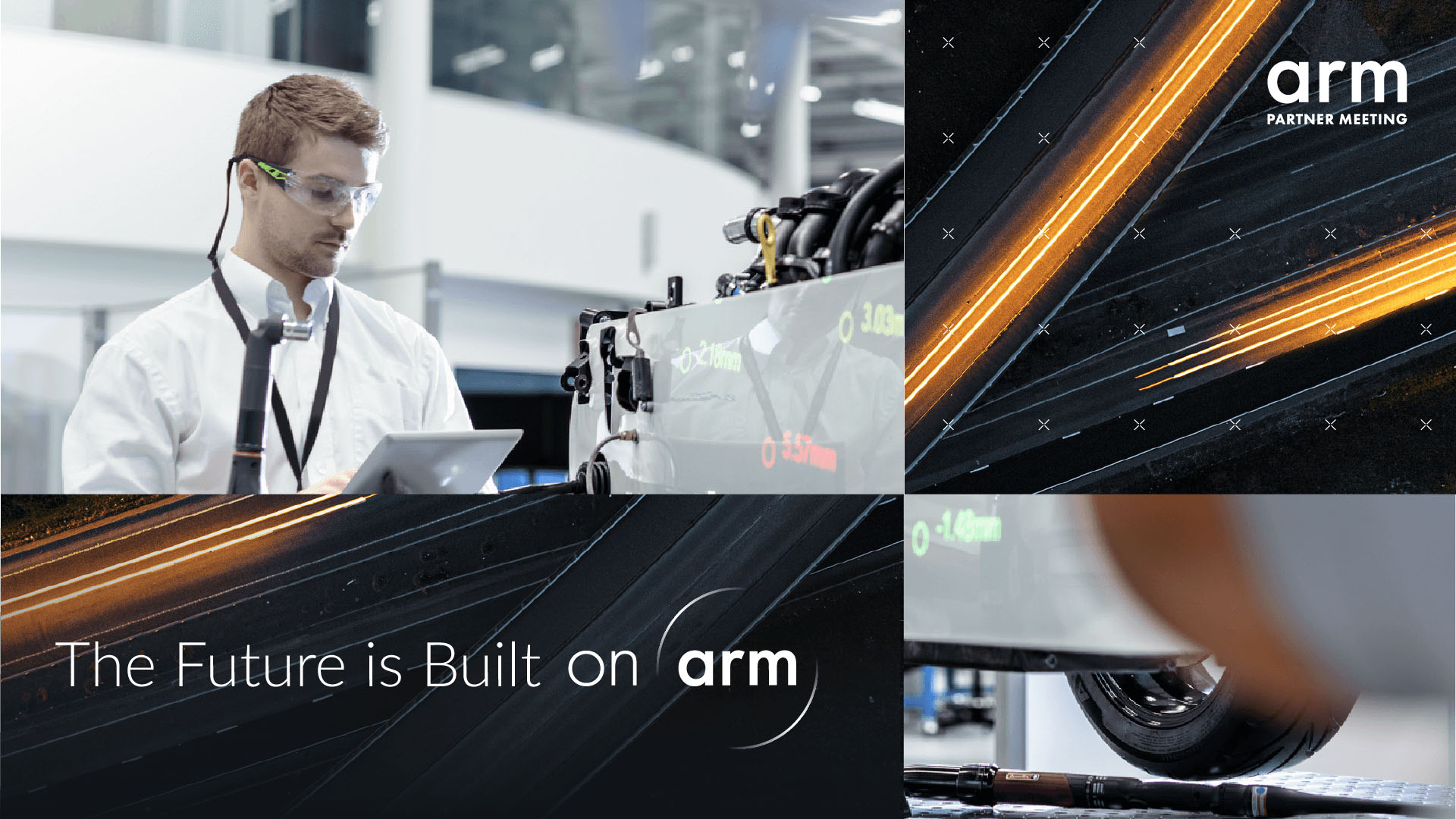
By using the Arm ‘Spotlight’ graphic in a new and unique way, we have created dramatic compositions that are designed to reinforce the idea that Arm with its partners are constantly moving forward, creating new perspectives and driving change – Arm are a disruptor and change-maker in the world.

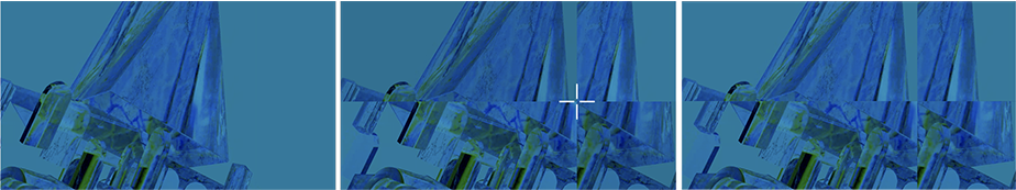
The imagery should always either be a direct reference to Cambridge and/or technology, and by using one image from four different perspectives and/or depths, this image treatment creates a refracted look and imitates disruption. Although we are utilising different perspectives and depths, this refracted look must look intentional, and must not look like a mistake.
This treatment can also be used with just two images where desired (please see the ‘Best Practice’ section for your reference).
Similarly to the above, when combining the gradients with this image treatment, the gradient must be prominent enough in it’s placement and opacity so as to not look like a mistake.


Best Practice Application
Overview of Brand Assets
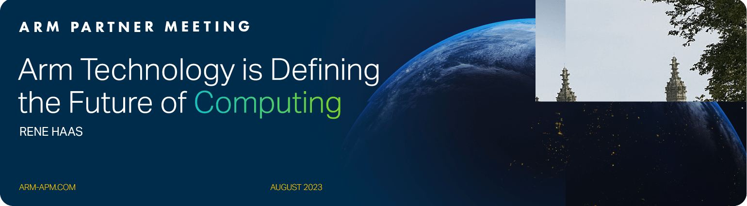
16:9 Landscape Applications
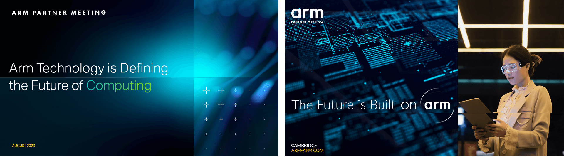
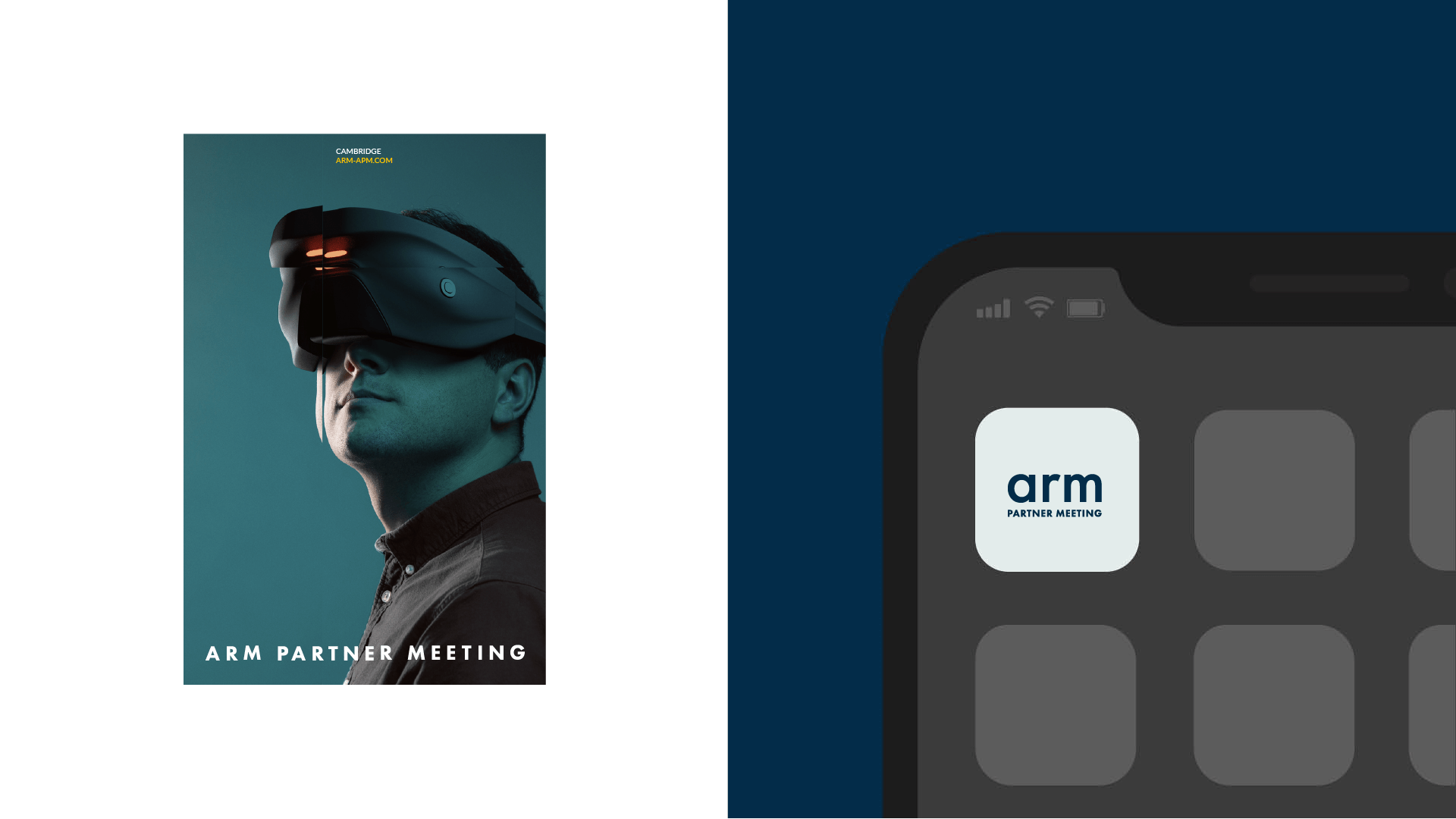
Poster Application
Digital Banner
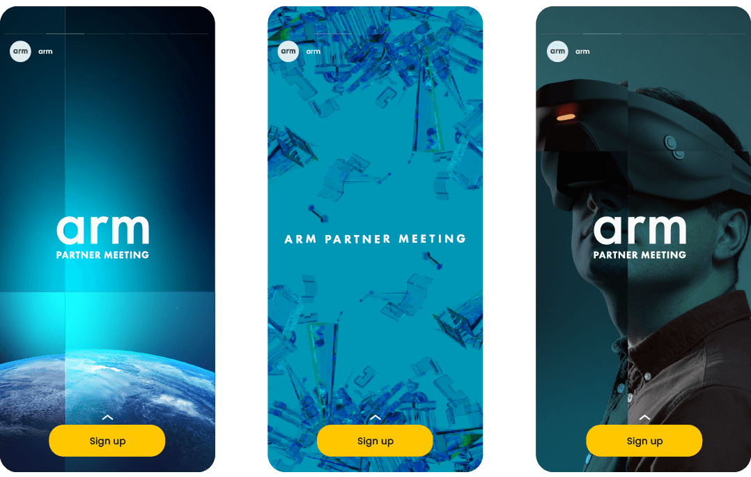
Social Stories
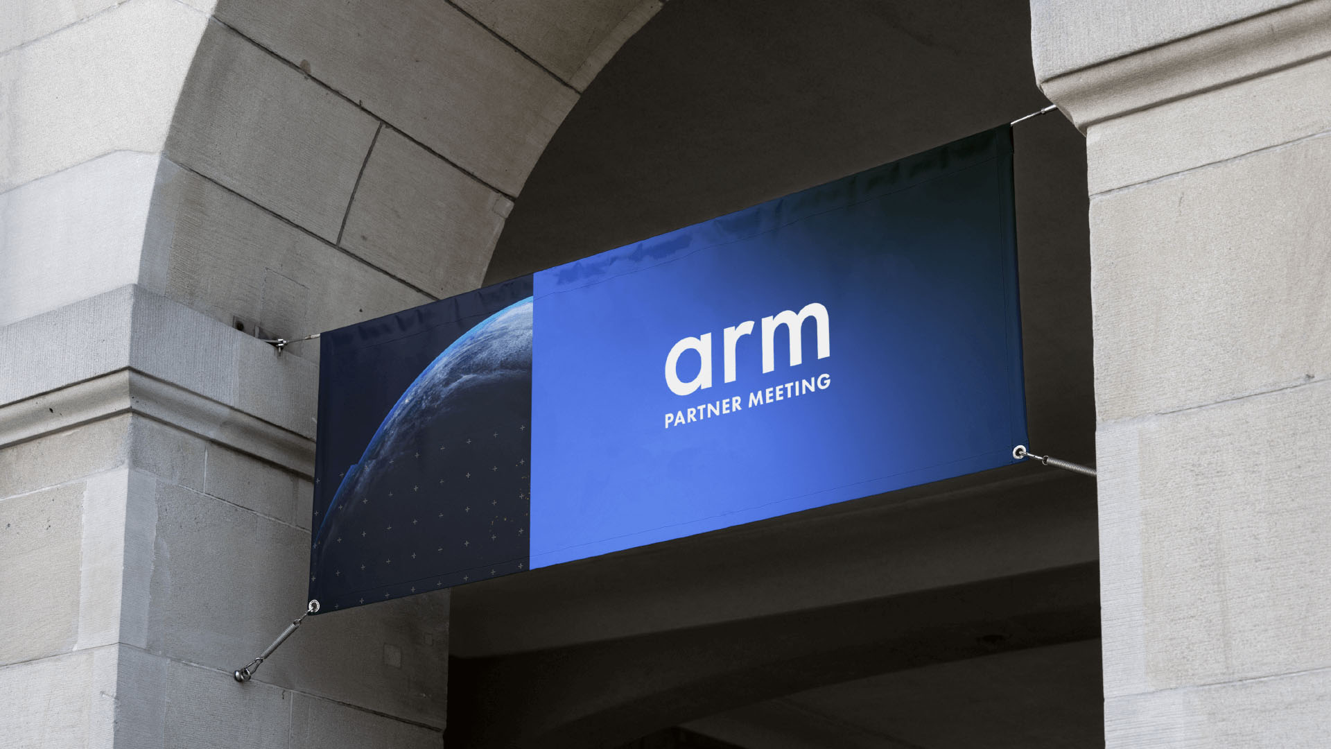
OOH Banner
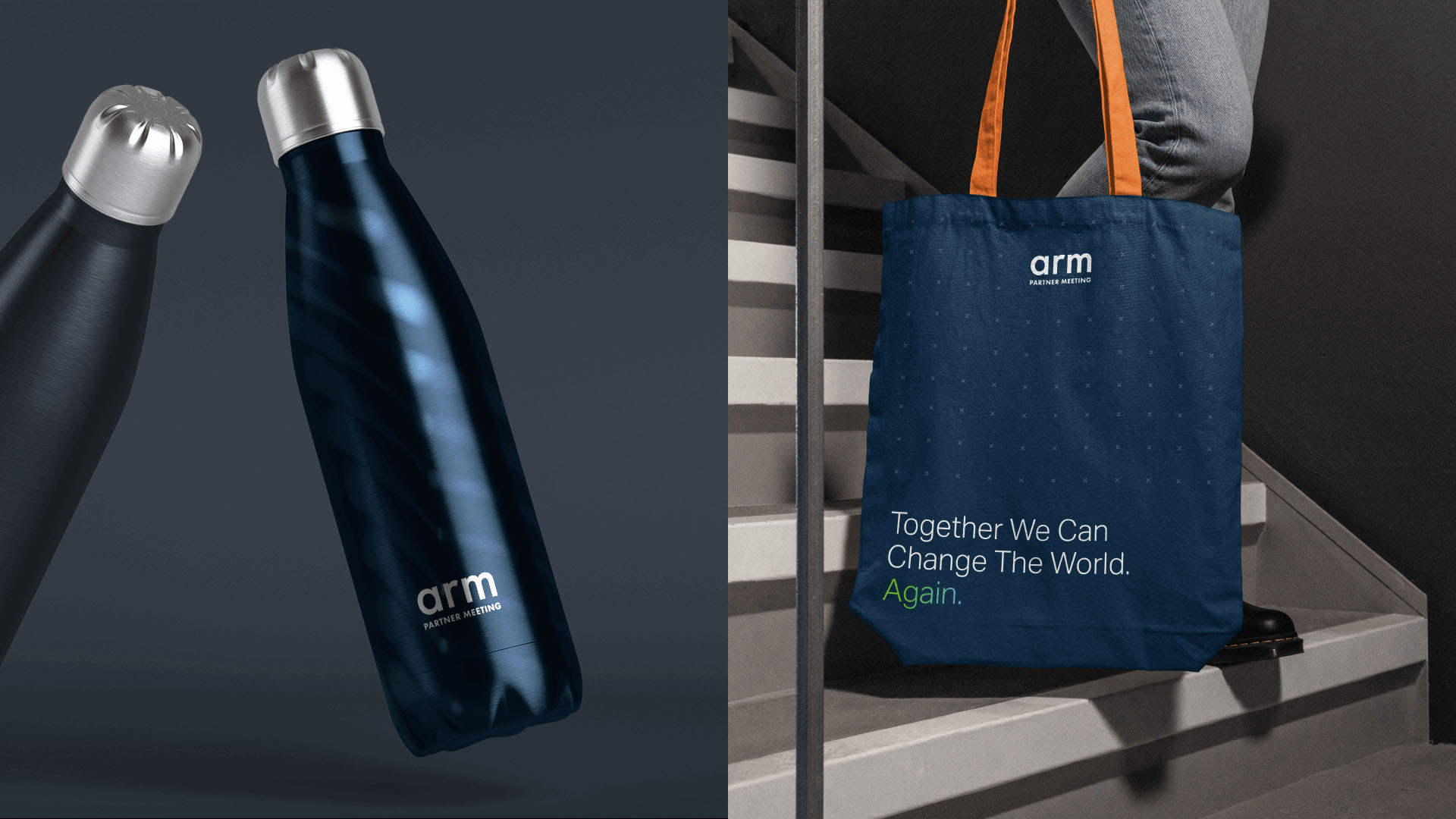
Merchandise
Social Application
Get In Touch
If you have any questions or need further help, contact us at rhianna@shoptalklondon.com.